MENU

Fersk is a new consumer goods brand launching with a line of premium, natural products in a competitive wellness and lifestyle market.
While the product quality was exceptional, they lacked a cohesive visual identity and packaging system. They needed a minimalist, premium brand that maximized shelf visibility and communicated purity.
Fersk is a new, ambitious consumer goods brand launching with a line of premium, natural wellness products aimed at the modern, conscious consumer.
Despite having exceptional product quality, Fersk lacked the visual framework to communicate its premium value. They needed a strong, minimalist identity and scalable packaging system to differentiate themselves and capture market attention immediately.

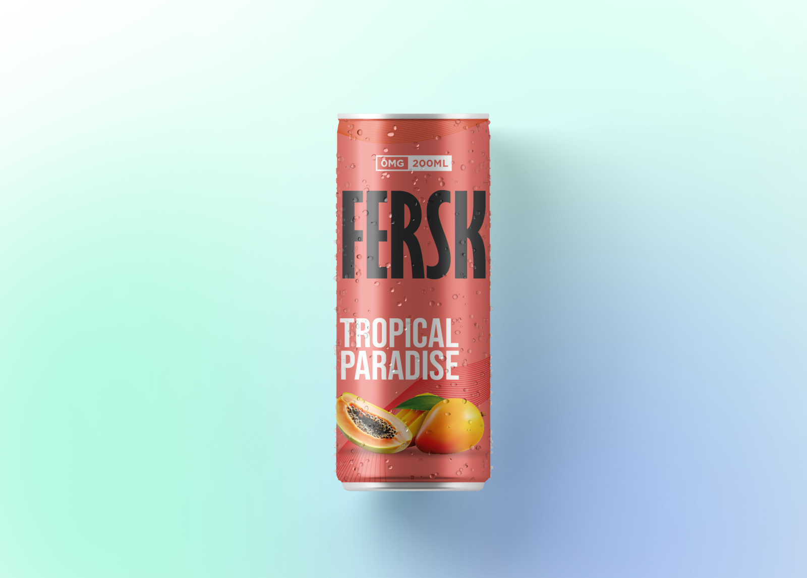
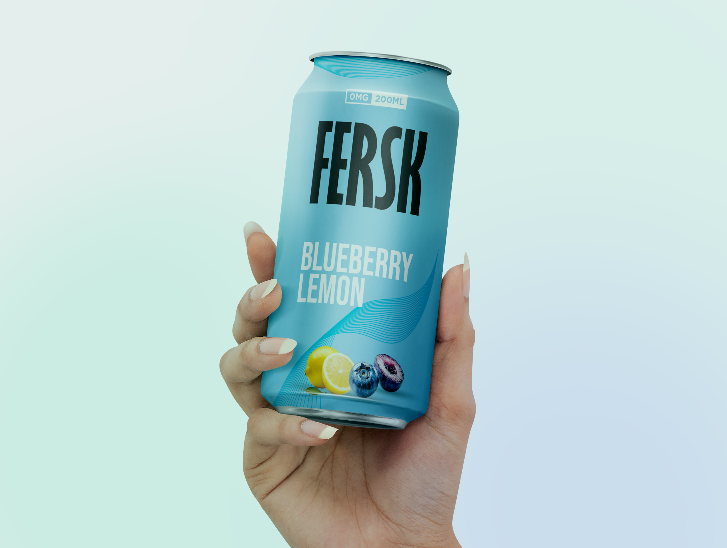
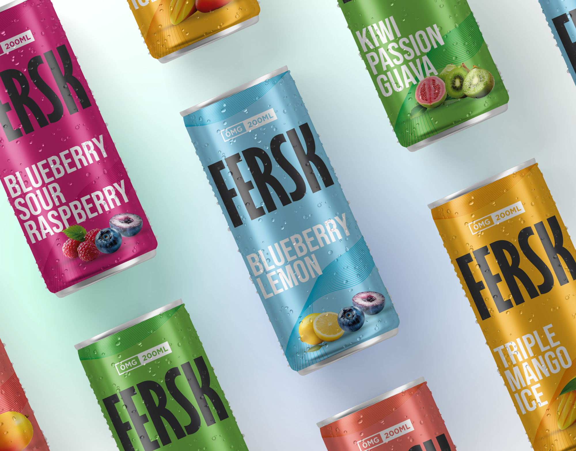
We developed a Scandinavian-inspired identity centered on purity, clarity, and quality. Our approach was to build a system that was minimal in execution but maximal in shelf presence and market distinction.
We designed a custom geometric wordmark, defined a crisp, clean typography system, and established a restrictive color palette dominated by white space and natural, earthy accents.
We engineered a flexible packaging template that prioritized clarity. It uses a unified grid and premium, tactile materials to elevate the unboxing experience and ensure easy adaptation across new product lines.
We created comprehensive brand guidelines for print and digital applications, ensuring the Fersk team could implement the new identity flawlessly across their e-commerce store and marketing channels.
We established the brand voice and messaging framework, focusing on clear, direct language that emphasizes product purity, immediately differentiating Fersk from its competitors.


See how we’ve helped brands grow and succeed.